Introduction to Roast My Website
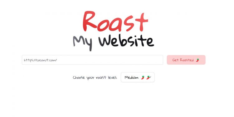
Roast My Website is an AI website analysis tool where users can enter the URL to receive feedback from AI. It is not difficult to see from the tool name that Roast My Website mainly provides negative criticism of the website.
Roast My Website can be used for free, and users only need to visit the link below. It adopts Firecrawl, which can read website contents and place it in a visual LLM model to comprehensively analyze the problems of the website.
Related Post: TestMyWebsite an AI Website Analysis Tool
How to Use Roast My Website
We use Roast My Website to analyze our website. After entering the URL, we can choose Roast Level, which is the degree of AI evaluation. Roast Level is divided into Mid, Medium, and Spicy. We first choose Medium to receive AI’s evaluation of the website:
Looks like this website has everything… except a sense of design coherence. The navigation bar feels like it’s auditioning for a roller coaster with its ups and downs. And let’s not even talk about the font overload—I’ve seen ransom notes with better typography. The overall structure screams “organized chaos,” but give it credit for one thing: it certainly keeps you guessing what’s going to fall apart next! Time to set my browser’s “back” button to escape this AI tool station.
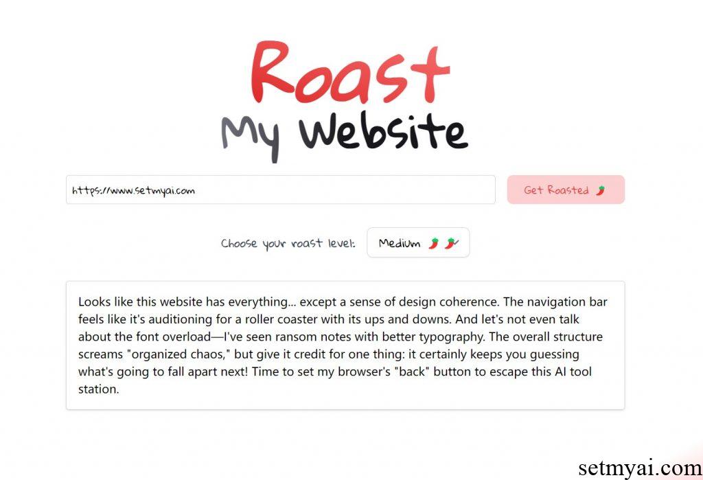
Roast My Website believes that our website lacks design coherence and the structure screams organized chaos. We adjust the Roast Level to Spicy and continue seeking AI evaluations:
Wow, just wow. It looks like you threw every possible element from a WordPress widget dump and managed to create one of the least user-friendly, most visually offensive monstrosities on the web. The site’s aesthetic appears to have been inspired by early 2000s MySpace pages – chaotic, cluttered, and an absolute eye-sore with mismatched font choices and an array of clashing colors. Did someone forget to tell you that less is more? Functionally, it’s like each section and post is fighting for attention, leading to a catastrophic user experience that makes me want to exit faster than a popup advert for free software. It’s a tragic mess of overloaded ads, painfully slow load speeds, and a layout that does no justice to the purported AI tools you’re advertising. You might want to consider a complete overhaul – because right now, the only intelligence this AI tools site is showing is how not to design a website.
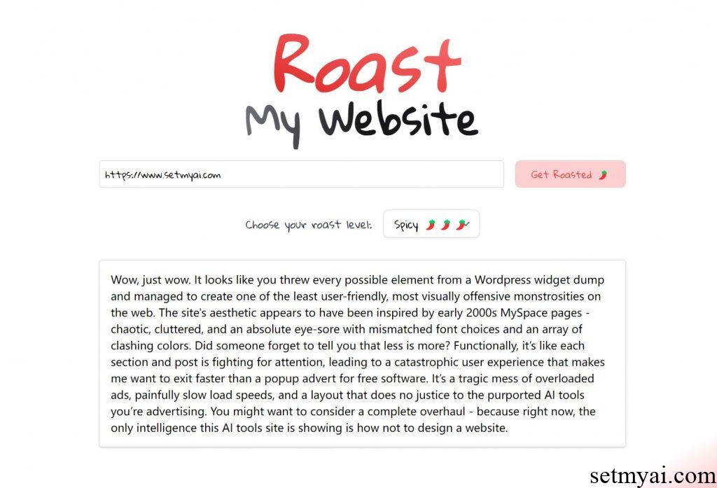
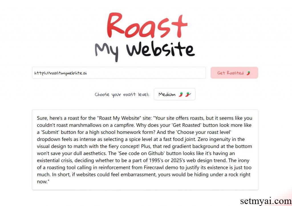
Roast My Website believes that our website design style is stuck in the early 21st century and the website response time is relatively slow. As an AI website, the only intelligence is to tell users not to design the website in this way. Roast My Website has very strict evaluations of each website, and when we enter its own domain name, AI believes that this website also has shortcomings:
Sure, here’s a roast for the “Roast My Website” site: “Your site offers roasts, but it seems like you couldn’t roast marshmallows on a campfire. Why does your ‘Get Roasted’ button look more like a ‘Submit’ button for a high school homework form? And the ‘Choose your roast level’ dropdown feels as intense as selecting a spice level at a fast food joint. Zero ingenuity in the visual design to match with the fiery concept! Plus, that red gradient background at the bottom won’t save your dull aesthetics. The ‘See code on Github’ button looks like it’s having an existential crisis, deciding whether to be a part of 1995’s or 2025’s web design trend. The irony of a roasting tool calling in reinforcement from Firecrawl demo to justify its existence is just too much. In short, if websites could feel embarrassment, yours would be hiding under a rock right now.”
Summary
As an artificial intelligence tool, Roast My Website can provide users with spicy website reviews.
Website:
